Gustav Klimt:
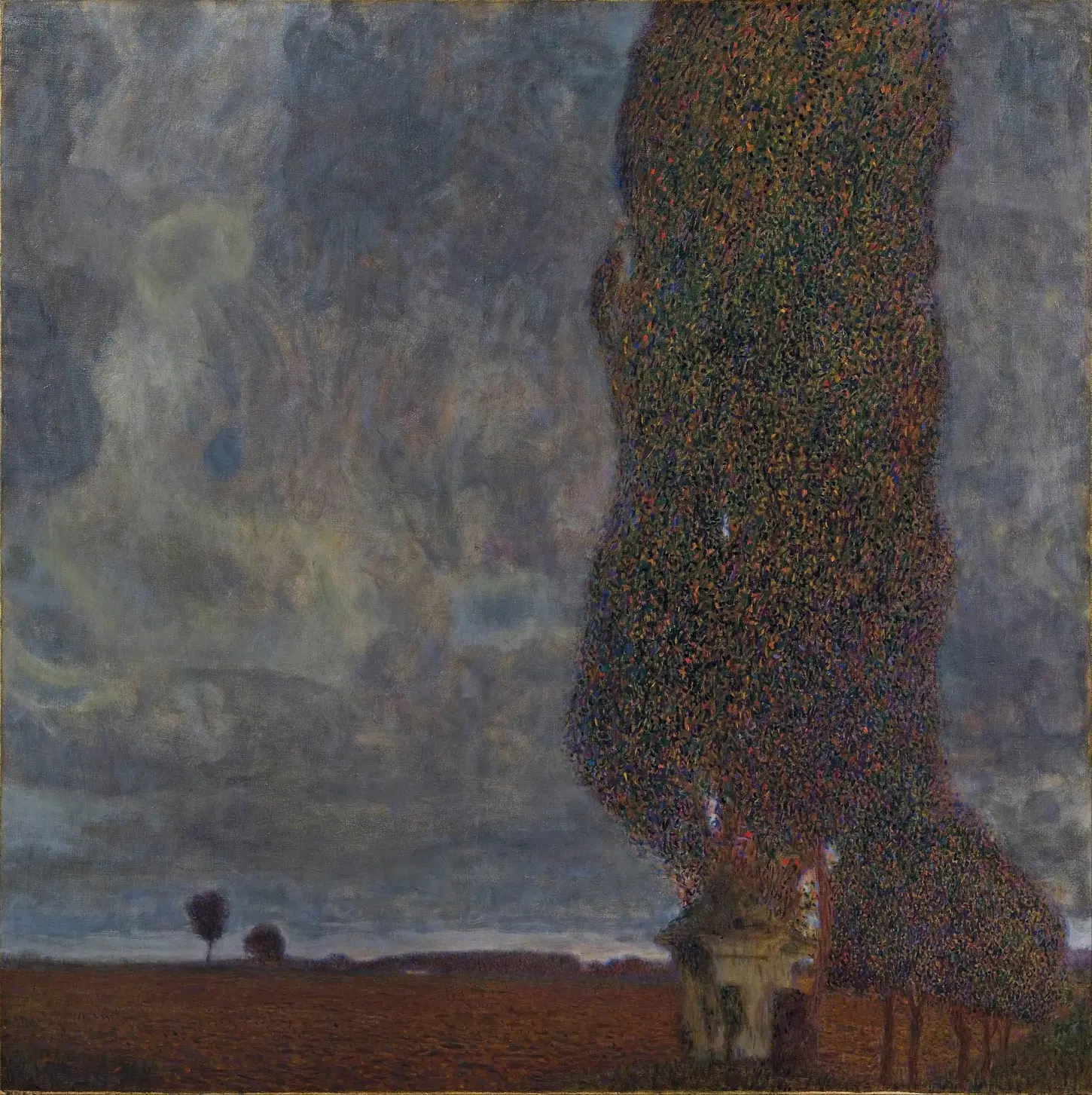
The Large Poplar II (Gathering Storm) (Die große Pappel II, Aufziehendes Gewitter), 1902/03
Oil on canvas
100.8 × 100.8 cm
©Leopold Museum, Vienna
(Natter no. 147)
The Large Poplar II (Gathering Storm) remains one of Gustav Klimt’s most structurally rigid and atmospheric landscape paintings. Executed between 1902 and 1903, the canvas documents a major transitional phase in the artist’s approach to open-air compositions and physical space.
Location and Framing Methods
Between 1900 and 1907, Gustav Klimt spent his summer residencies with the Flöge family in Litzlberg on the Attersee, focusing his practice on hyper-local topographies around the local brewery and lake house. This specific canvas depicts a solitary poplar tree flanking the historic Seehofkapelle—a physical botanical landmark that remained a fixture of the local Austrian landscape until it was struck by lightning and destroyed in 1928. To isolate this motif, archival documentation confirms Klimt utilized a cardboard square viewfinder, forcing a planar compression that intentionally strips the landscape of traditional three-dimensional depth.
Changes from the 1900 Composition
The structural tension of this composition becomes evident when contrasted with its predecessor, The Large Poplar I (1900, Neue Galerie New York). While the 1900 canvas treats the poplar as an organic entity under a pale, luminous sky, the 1902/03 version executes a radical stylistic shift toward a highly stylized, European pointillism. Klimt was exposed to French and Belgian Neo-Impressionist works exhibited at the Vienna Secession, but he subverted their scientific focus on light. Instead of using divided brushstrokes to dissolve forms into vibrating luminosity, Klimt utilized the pointillist dot to build a dense, mosaic-like barrier. The contemporary art critic Ludwig Hevesi termed these rhythmic, multi-colored applications of pigment “Forellentupfen” (trout-dotting) due to their resemblance to the iridescent, patterned scales of a trout.
Brushwork and Color Palette
This systematic, repetitive application of paint reinforces a distinct, somber undertone that separates the work from Klimt’s typically celebratory summer landscapes. By dropping the horizon line to an extreme low, the meadow is reduced to a narrow anchor for an asymmetrical, geometric column. The background sky rejects deep atmospheric perspective, utilizing a heavy, flat expanse of monochromatic grays and dark blues to signify the oppressive physical pressure of a gathering storm. The dots of the foliage do not flicker with light; they appear petrified, turning the tree into a rigid, ominous structure. The small chapel sits precisely at the intersection of the vertical tree and the horizontal field, anchoring the abstract mass. When debuted at the Secession retrospective of 1903/04, contemporary reviewers immediately noted that this specific surface treatment generated a dark, claustrophobic mood, transforming a pastoral outdoor study into a vessel for psychological weight and existential gravity.
Color Differences in Digital Images
The visual reception of this painting online is heavily distorted by varying photographic reproductions. Many widely circulated digital images display an artificially lightened, yellowed, or high-contrast palette. Archival documentation reveals that these discrepancies stem from outdated slide scans taken prior to modern varnish removal, or from commercial printing houses altering the file to increase consumer appeal. The official registration from the Leopold Museum establishes that the true tonal values of the canvas are rooted in cool, dense, dark charcoal-grays and muted blues. This calibrated institutional imagery directly correlates with historical text sources from 1903, which explicitly emphasize the painting’s heavy, unyielding monochromatic gloom rather than a bright or saturated sky.
Leave a Reply